We are attracted to beautiful things and repelled by ugly things—the words “beautiful” and “ugly” are in fact often defined in terms of the human response to the things so described. Fear of ugliness may not be rational, but it is always real and it always changes behavior. I was aware of this in a rather general way, but I hadn’t begun to think of the applications to my own field of engineering until I was at a utility meeting in the Midwest. A female boilermaker said “Why does power generating and transmission equipment of all types—and the buildings it’s in, too—always have to be so d*&#ed f#@&ing ugly!” Her language was a lot bluer than that, but you get how angry she was.
ugly [ uhg-lee ], adjective
Origin: 1200–50; Middle English ugly, uglike<Old Norse uggligr fearful, dreadful, equivalent to ugg(r) fear + -ligr-ly
Definition: a) unattractive, b) dangerous, threatening, c) very bad; terrible
Related forms: ug·li·ly, adverb; ug·li·ness, noun
Synonyms: unattractive, appalling, awful, dreadful, evil, forbidding, frightful, horrifying, malevolent, menacing, ominous, repelling, repugnant, repulsive, revolting, sinister, wickedSelections from Dictionary.com and Thesaurus.com
It struck me that there is a profound connection between the lady’s outburst and the pervasive “not-in-my-backyard” (NIMBY) opposition to all types of utility planning in the U.S. that costs the industry hundreds of millions, if not billions, of dollars. From power plant upgrades and construction to high voltage transmission line siting, when it comes time to put a shovel in the ground it’s almost as if the country were at war with itself. Looking at it from that perspective, it’s surprising that some basic fundamentals of design and—dare we say it—ambiance have not been brought into play to counter some of the fear and opposition that seems to naturally spring up around utility projects.
When I talk to engineers on these projects, they talk about primary cost and efficiency driving the design. They don’t even mention the appearance of power production equipment, and if questioned they dismiss appearance as unimportant. Yet the appearance of a power project, its overall visual impact on someone who does not have any understanding of the basic engineering function of the structure, can generate sufficient opposition to kill a project. Community resistance is considered a natural force, like inertia, that must be overcome to advance every project. What if it were instead a pivot point around which the project could fluidly rotate?
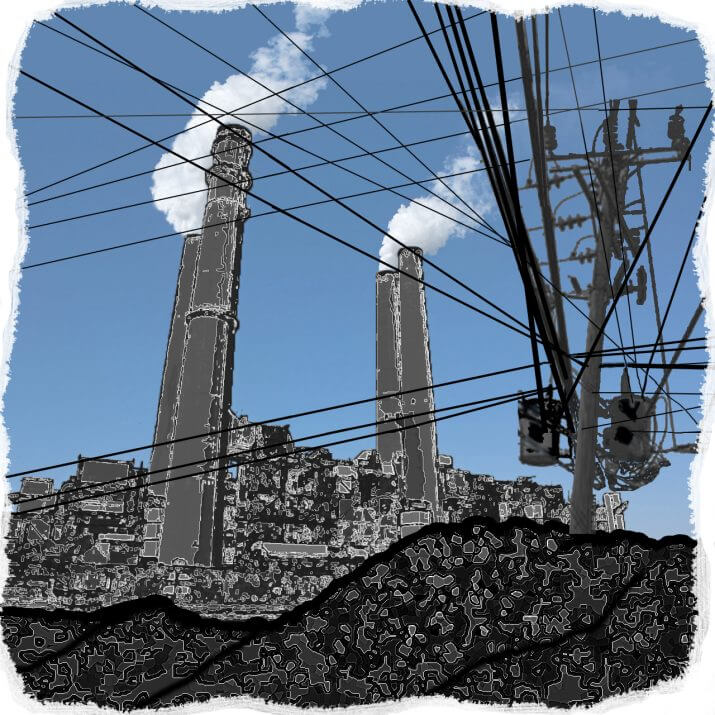
Ironically, both the designers of the system and those opposed to it have exactly the same unspoken belief: that a power plant must necessarily be a humungous ugly box with pipes sticking out of it and a bunch of gun barrels pointing up that belch “smoke,” that a coal-fired plant must be surrounded by a surreal barren landscape of large scabrous black hills, that nuclear plants must look sinister, and that high voltage transmission lines must resemble an alien giant’s game of Pick-Up Sticks. This shared presumption is especially relevant to environmentalists’ view of these projects—a view that sees the engineered artifacts of the industry as diametric opposites to the natural biosphere and the fractal designs of its organisms.
With these thoughts bouncing around my brain, when I later had occasion to talk with people who were opposing construction and modification of power generation or transmission structures, I asked: “Were you ever shown alternate designs for the project that would have made it integrate more harmoniously with its environment, and if you had, would this have made any difference to your NIMBY approach?” Should I have been so stunned that the answer was regularly no, they had never been shown any alternate designs, and of course it would have made a difference if they had been?
We have to ask ourselves as a utility industry if we can do a better job of creating and building our systems by considering this “unimportant” aspect of design, especially with the emphasis on today’s smart and efficient grid.
Let’s pursue this hypothesis in greater detail. I read current news articles about expansion plans and essential project needs relative to the current power grid, and it appears that, in the U.S., for every $1 spent by power companies on power infrastructure planning, roughly $2 is spent organizing opposition to whatever the plan is. If you treat this as an exercise in overcoming inertia, and apply an arbitrary value of +1 to the benefit of an upgrade, then the value of the opposition is -2. In other words, the utility will have to spend three times the initial planning cost estimate to get where it needs to go—and most of the extra cost is devoted to legal and consultancy fees to overcome or steamroller opposition.
From the perspective of my conversation with the lady boilermaker, I began to wonder why so little is invested in considering how a better design would lower the level of “inertial” resistance. I looked back at some of the engineering marvels of the 19th and 20th century, and there seemed to be a pattern of transition from a focus on in-your-face power to a focus on architectural ambiance—and the stunning thing I discovered (which really should not have surprised me) is that the more aesthetic or beautiful the design, the better it functions. This would not be a surprise to Leonardo Da Vinci in the 16th century but apparently it’s a lesson that most of us need to relearn today.
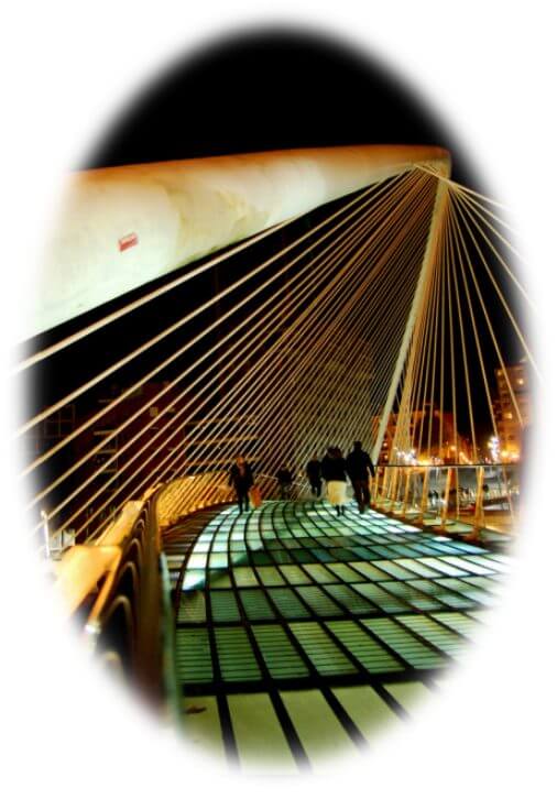
One person who comes to mind who does not have to relearn the lesson is Santiago Calatrava, the Spanish architect, sculptor and structural engineer whose public structures have become a byword for the marriage of form and function. I well remember when I first saw a Calatrava bridge, and it literally took my breath away. Of course, I had to go and talk to the maintenance engineers, and I was told that it far exceeded its design parameters—emphasizing once again that beautiful form creates improved function.
Often when an industry is looking for innovation and new paradigms it helps to look at other industries that have approached this problem from a different angle. Let’s look at the marine industry in which the form and function is literally a survival necessity against the ocean. Ugly and non-functional models are swallowed very quickly in this Darwinian industry of survival of the fittest, as the ocean and its environs make very short shrift of poor design.

Take a look at ships. The Clipper sailing ship visibly flows into its function with superb design lines. Look at today’s supertankers and cargo carriers—some bigger than many power plants—and you will see a similar integration of form and function. Both have one thing in common: they have to flow with their environment to survive.
Whatever form of energy powers our energy grid in the future, it seems an inescapable conclusion to me that the grid will have to do a much better job of coexisting with its own environment, both physical and social. Indeed, when you are on top of Jim Bridger power station in Wyoming in the middle of a storm, being buffeted by the wind as though you were on the tip of the topmast of a Clipper ship, the parallels are more than obvious.
Several times we have been told bluntly by utility experts (sic) that this is simply the way it is and nothing major can be done to change the visual design fundamentals of power production plants (including the latest renewable designs), high voltage transmission lines, end distribution systems, etc. To which my immediate knee jerk response is “Oh, really?”.
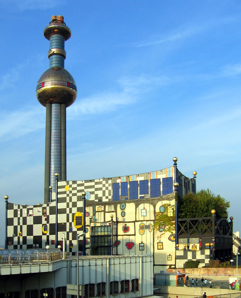
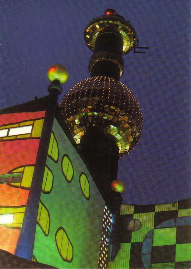
In Vienna, Austria, surrounded by dramatic Baroque architecture intermingled with the remnants of stark Soviet housing systems, is one of the most attractive (yes, attractive) power plants in the world. It was retrofitted by an incredible architect, the late Friedensreich Hundertwasser, and completed in 1992. He turned an eyesore that was slated for demolition into an artistic ecosystem that should be looked at by senior executives of utilities everywhere. Here is a fascinating example of what is truly possible with advanced design integration of form and function. When you are taking a boat trip down the blue Danube at night and you come around the bend to Spittelau and the boat guide calmly says “and on your left, with the twinkling lights, you will see the beautiful facility of Wien Energie Fernwärme” at first you think there has been a translation error. It becomes even more bewildering when the guide talks about the art gallery and summer concerts played at the district heating and waste disposal plant—but then you get closer and see what a power plant could really, really be like. It gets even more interesting when you take a tour of the plant itself, and see that the inside is not only as pleasing to the eye as the outside, but it is also sparkling clean.
The residents of the neighborhood around the plant are among its most ardent supporters. I wonder what the effect would be on so many NIMBYs if form and function were to be so closely intertwined. Imagine plants at Four Corners, Mojave, Rock Springs or Crystal River that show the majesty of the environment around them instead of standing out like sore thumbs (or big middle fingers). Extend this further with all types of facilities (including nuclear) and you can see that a very big communications gap needs to be bridged.
Next, let’s look at the lifelines and nervous systems of the modern utility grid, without which we would return to our caves with candles: the high voltage transmission (HVT) lines and towers that carry the energy thousands of miles from the plants that create it to areas that need it. Opposition to any needed new or upgraded HVT lines for our modern electrical grid has reached some 90% of all proposals. Federal mandates were devised to enable implementation of new transmission lines, but even these are now bogged down in legal opposition.
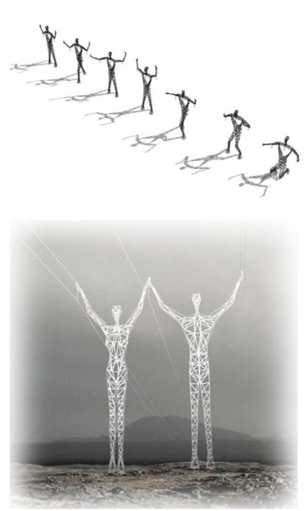
What would happen if the design of the line were humanized to the extent that it added to instead of fought against its environment? The images on the left illustrate a design proposal by Choi+Shine Architects, appropriately called “Land of the Giants™.” To test the response of a group that has been very vocal in its opposition to transmission towers on its lands, we went to a Native American Pueblo with some hypothetical designs for a line of pylons telling one of the mythical tales of Coyote. Towers could be crafted to represent the characters of several historical tales that would honor the cultures of the land on which they stood. The angry faces relaxed into smiles, and then became thoughtful when I showed how elders in the culture could transfer knowledge to the younger generation in new ways by working with parametric modeling and other digital interfaces to integrate the stories and the engineering, to create structures that would stand in majesty for a long time. Could intractable opposition to granting rights-of-way become willing collaboration? Extend this to telling stories of America’s growth, to representing its immigrants and the legendary characters associated with the land they passed through, its generations of ranchers, or any similar group whose culture and family history could be honored—you may not open all the doors, but you are showing that there is a win-win potential that did not exist before.
These are the bigger problems, but why not extend this type of thinking to the heaps of spaghetti that are at the end of the transmission chain, connecting to users? A whole new world of design opens up. Ask yourself: does it really make sense for the owner of a multi-million dollar facility or home to just let some utility eyesore be connected to their priceless design with so little consideration? And does it make sense for said owner to pour money and ingenuity into in-home energy saving devices and techniques when the transmission chain that brings the energy to the home leaks far more energy than an end user can save all along the way?
It’s not irrelevant to this discussion that oppressive regimes and dictatorships—from the Romans to the Soviets—have purposely used massive, blockish architecture to intimidate and instill fear. Is that something utilities in the US and elsewhere want to emulate? Is it easier to operate efficiently and profitably when you enjoy the support of your neighbors or when you are continuously at war with them? One of my specialties (actually a passion of mine) is Quality Assurance, and I always advise my clients to return to basics and start a QA program by reviewing Deming’s 14 Points—of which number 8 is “Drive out fear, so that everyone may work effectively for the company.” Not only the neighbors who look at it, but also the operators and maintenance workers who work in oppressive architecture respond negatively to it, consciously or unconsciously. Fear undermines productivity, efficiency and quality of work.
It should be no surprise that design upgrades closely coupling form and function achieve way more efficiency than their historical counterparts—sometimes twice and three times more. The Spittelau Wien Energie Fernwärme plant consistently operates at 120 to 130 percent of design capacity, and its emissions for all controlled pollutants range from less than one to just over 30 percent of the average for similar plants and the limits set by the plant’s permit under the Austrian Clean Air Act, one of the strictest in the world. All this from a design change—but then our marine engineering counterparts have always known this.
Beautiful power plants.
As your eye runs across
the outlin'd form
there is a symmetry
you see, and a purpose:
Quality is utility.
In short, our industry needs a wakeup call on the new design paradigm possibilities available so that our mighty energy system can sail with the environmental ecosystem challenges of the future. If we can learn from the harmonizing skills of Friedensreich Hundertwasser, the awesome majesty of Choi+Shine’s Land of the Giants, and similar mentors, the transitional weather will be a lot smoother.
P.S. I would like to include a thanks to the lady boilermaker who first started me along this line of thought with her perfect comment after the meeting in the Midwest (I think it was Evansville, Indiana, but I could be wrong). After the meeting, she gave us a tour of her (Blue) Harley Davidson workshop, which was combined with a woodworking workshop, to show the efficiency and safety benefits of good design. She was not shy about telling us how the power plant where she worked was exactly the opposite, and how it could affect a new generation of plant workers if changes were made. I have long forgotten her name, but she knows who she is. Dear lady, if you are reading this, email us so I can include suitable credits in this story.
Hey Pete,
Do you mind if I re-publish this essay? Has been great since you wrote it, and I still refer others to it several times a year. But now places like Energy Central has the links messed up and it looks like it has been deleted — unless you come directly to your site and search for it.
Thanks!
Hi Phil
Just saw this , feel free